About Project
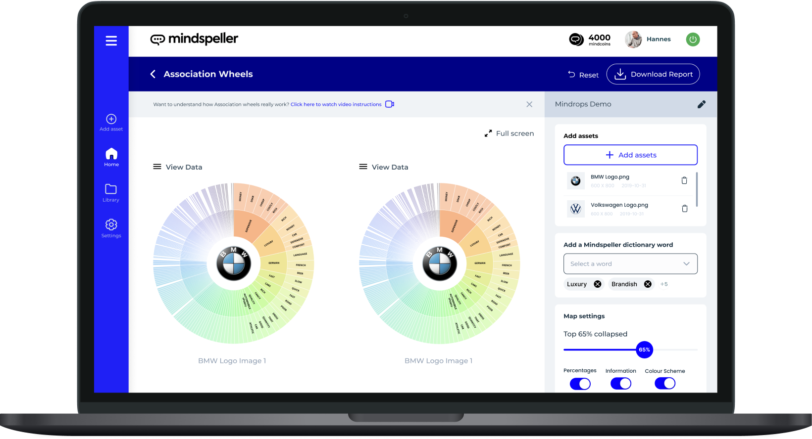
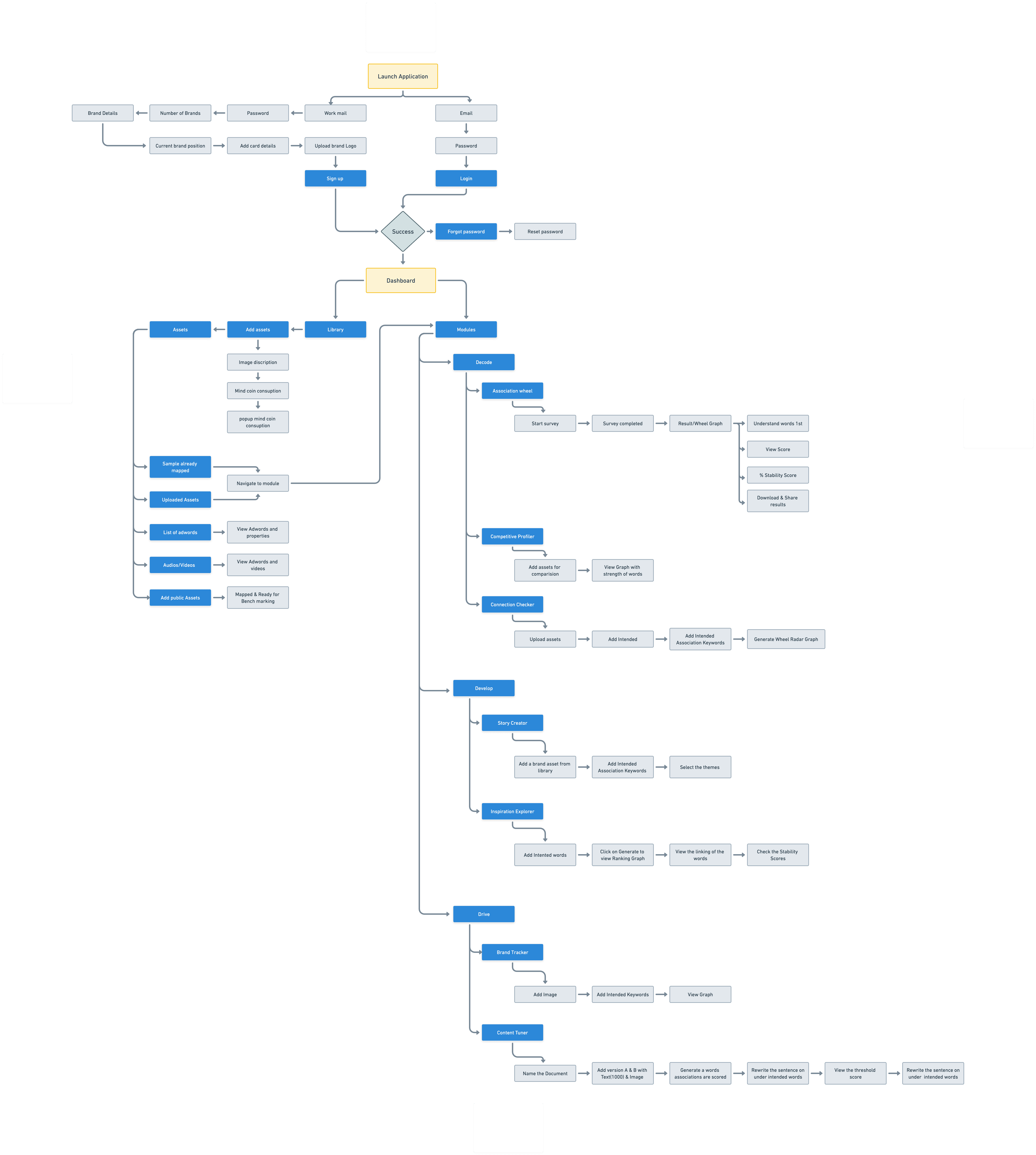
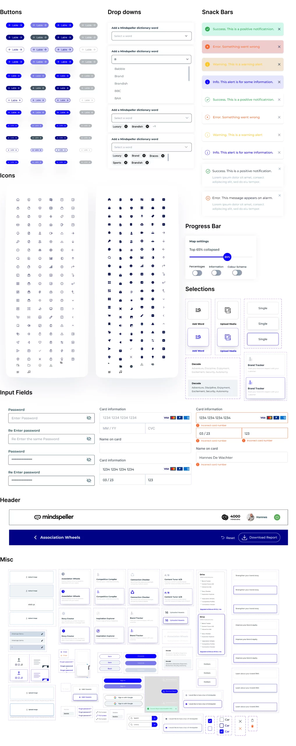
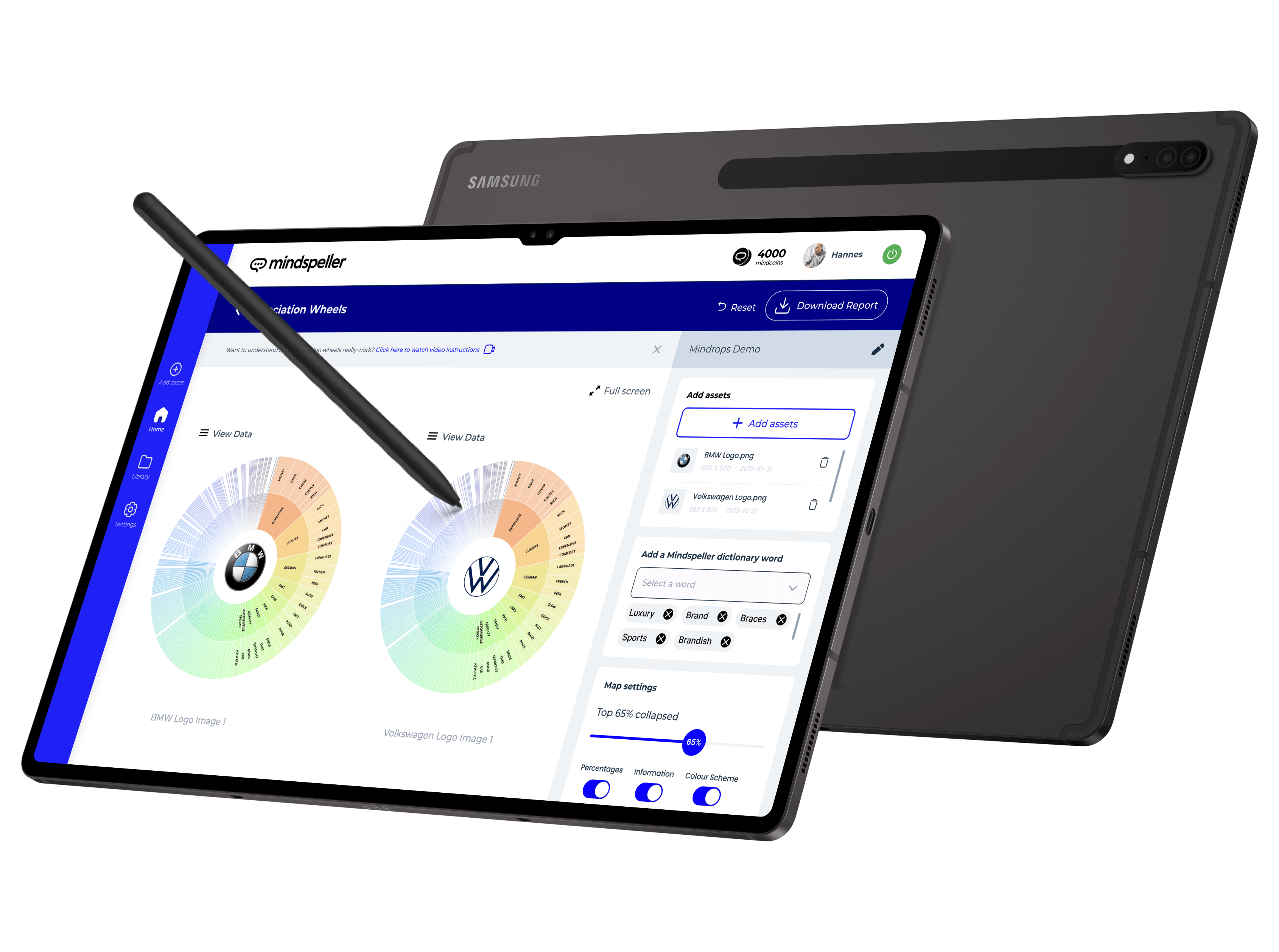
Mindspeller, a leading-edge company, has pioneered a human-centric AI platform focused on empowering users to construct impactful and captivating brand strategies. Through their innovative platform, businesses can harness the power of AI to create compelling and effective brand identities that resonate with their target audience, ultimately driving success and growth. Mindspeller predicts the impact of users’ campaigns on brand equity. This would be possible only through comparisons and evaluations.